── Attaching packages ─────────────────────────────────────── tidyverse 1.3.2 ──
✔ ggplot2 3.4.1     ✔ purrr   1.0.1
✔ tibble  3.1.8     ✔ dplyr   1.1.0
✔ tidyr   1.2.1     ✔ stringr 1.5.0
✔ readr   2.1.3     ✔ forcats 0.5.2
── Conflicts ────────────────────────────────────────── tidyverse_conflicts() ──
✖ dplyr::filter() masks stats::filter()
✖ dplyr::lag()    masks stats::lag()
here() starts at /Users/deannalanier/Desktop/All_Classes_UGA/2023Spr_Classes/MADA/deannalanier-MADA-portfolio


Attaching package: 'scales'


The following object is masked from 'package:purrr':

    discard


The following object is masked from 'package:readr':

    col_factor


Attaching package: 'plotly'


The following object is masked from 'package:ggplot2':

    last_plot


The following object is masked from 'package:stats':

    filter


The following object is masked from 'package:graphics':

layoutFlu Anlaysis - Exploration
Load Libraries
Load the data
#path to clean data
data = readRDS(here("fluanalysis", "data", "cleandata.rds")) #load RDS file
For each (important) variable, produce and print some numerical output (e.g. a table or some summary statistics numbers).
Summary table of the Nausea column
#Summary of Nausea
nausea_summary = data%>% #nasea summary
  pull(Nausea)%>%
  summary()%>%
  as.data.frame()%>%
  rename(Freq = 1)
#nausea_Data = data.frame(nausea_Data)

nausea_summary%>%
gt(rownames_to_stub = TRUE)%>%
tab_header(
  title = "Flu Data Nausea Summary table",
  subtitle = "Frequency of 'Yes' and 'No' Responses"
)%>%
 tab_style(
     locations = cells_title(groups = "title"),
     style     = list(
       cell_text(weight = "bold", size = 24)
))| Flu Data Nausea Summary table | |
| Frequency of 'Yes' and 'No' Responses | |
| Freq | |
|---|---|
| No | 475 |
| Yes | 255 |
Summary table of the body temperature column
bodyTemp_summary = data%>% #bodyTemperature summary
  pull(BodyTemp)%>%
  as.data.frame()%>%
  summary()%>%
  as.data.frame() %>%
  separate(Freq, c('Stat', 'Val'),":")%>% #separate summary statistics at ":"
  select( -c(1, 2)) #remove the first two empty rows

bodyTemp_summary%>%
gt(rownames_to_stub = TRUE)%>%
tab_header(
  title = "Flu Data Body Temp Summary table",
  subtitle = "Summary Statistics"
)%>%
 tab_style(
     locations = cells_title(groups = "title"),
     style     = list(
       cell_text(weight = "bold", size = 24)
))| Flu Data Body Temp Summary table | ||
| Summary Statistics | ||
| Stat | Val | |
|---|---|---|
| 1 | Min. | 97.20 |
| 2 | 1st Qu. | 98.20 |
| 3 | Median | 98.50 |
| 4 | Mean | 98.94 |
| 5 | 3rd Qu. | 99.30 |
| 6 | Max. | 103.10 |
For each (important) continuous variable, create a histogram or density plot.
Body Temperature is the only continuous important variable.
#Body Temperature Histogram

annotation = data.frame(
   x = c(100),
   y = c(.5),
   label = c("Mean")
)

p = data %>% ggplot(aes(x=BodyTemp)) + geom_histogram(aes(y=..density..), binwidth=0.2,color="black", fill="gray") + geom_density(alpha=.2,fill="#FF6666") + geom_vline(aes(xintercept=mean(BodyTemp)),color="red", linetype="dashed", size=1) + geom_segment(aes(x = 99.8, y = .5, xend = 99, yend = .5), arrow = arrow(length = unit(0.5, "cm"))) + annotate("text", x=100.1, y=0.5, label ="Mean")+ ggtitle("Body Temperature Density") +
  xlab("Temp") + ylab("Density")+ theme_minimal()
Warning: Using `size` aesthetic for lines was deprecated in ggplot2 3.4.0.
ℹ Please use `linewidth` instead.ggplotly(p)Warning: The dot-dot notation (`..density..`) was deprecated in ggplot2 3.4.0.
ℹ Please use `after_stat(density)` instead.
ℹ The deprecated feature was likely used in the ggplot2 package.
Please report the issue at <]8;;https://github.com/tidyverse/ggplot2/issueshttps://github.com/tidyverse/ggplot2/issues]8;;>.highest frequency/density is at 98.2(F).
Create scatterplots or boxplots or similar plots for the variable you decided is your main outcome of interest and the most important (or all depending on number of variables) independent variables/predictors. For this dataset, you can pick and choose a few predictor variables.
The firstirst outcome Interest is Body Temperature
#create violin plots of the outcome of interest and important variables.


#nausea and body temp
nausea_plot = data %>% ggplot(aes(x=Nausea, y=BodyTemp,fill=Nausea)) +
  geom_violin(trim=FALSE) + geom_boxplot(width=0.1, fill="white")+ ggtitle("Body Temp and Nausea")+scale_fill_brewer(palette="Dark2")+theme_minimal()
#nausea_plot

#Cough and body temp
cough_plot = data %>% ggplot(aes(x=CoughYN, y=BodyTemp,fill=CoughYN)) +
  geom_violin(trim=FALSE) + geom_boxplot(width=0.1, fill="white")+ ggtitle("Body Temp and Cough")+scale_fill_brewer(palette="Dark2")+theme_minimal()
#cough_plot

#Nasal Congestion and body temp
nasal_plot = data %>% ggplot(aes(x=NasalCongestion, y=BodyTemp,fill=NasalCongestion)) +
  geom_violin(trim=FALSE) + geom_boxplot(width=0.1, fill="white")+ ggtitle("Body Temp and Congestion")+scale_fill_brewer(palette="Dark2")+theme_minimal()
#nasal_plot

#Runny nose and body temp
nose_plot = data %>% ggplot(aes(x=RunnyNose, y=BodyTemp,fill=RunnyNose)) +
  geom_violin(trim=FALSE) + geom_boxplot(width=0.1, fill="white")+ ggtitle("Body Temp and Runny Nose")+scale_fill_brewer(palette="Dark2")+theme_minimal()
#nose_plot
#plot 2 on the sample plane
ggarrange(nausea_plot, cough_plot,
ncol = 2, nrow = 1, legend = "bottom")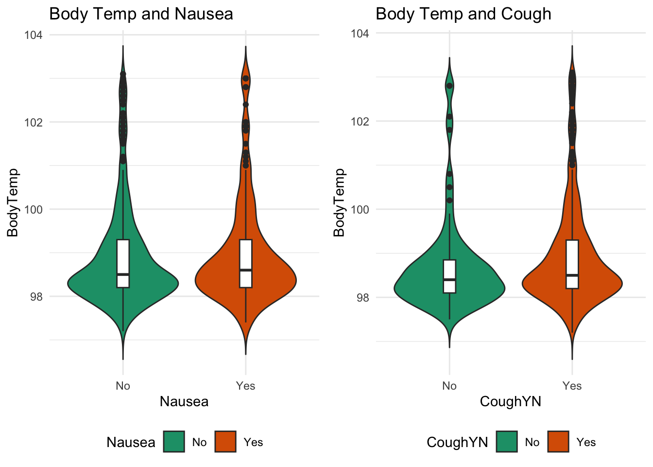
#plot the other two on the same plane
ggarrange(nose_plot, nasal_plot, ncol = 2, nrow = 1, legend = "bottom")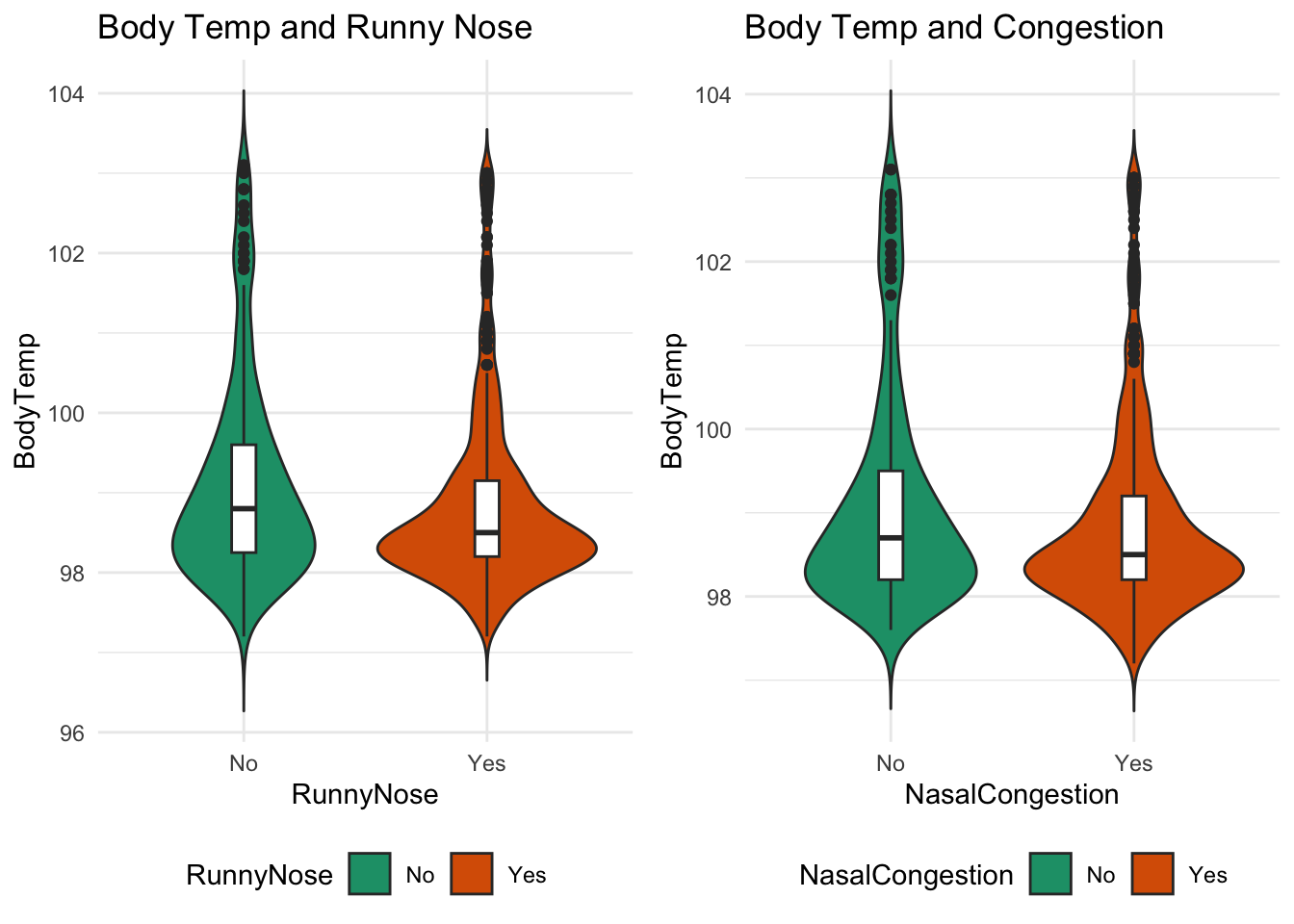
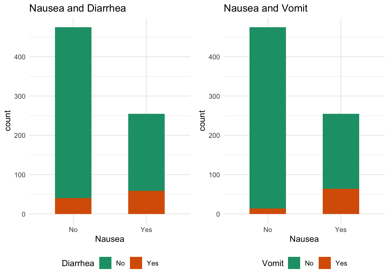
Second outcome interest is Nausea
#bar plot of the outcome of interest and different variables


#Nausea and Diarrhea bar plot
diarrhea_plot = data  %>% ggplot(aes(x=Nausea,fill = Diarrhea)) + geom_bar(width=0.5) + ggtitle("Nausea and Diarrhea")+scale_fill_brewer(palette="Dark2")+theme_minimal()
#diarrhea_plot

#Nausea and vomit bar plot
vomit_plot = data  %>% ggplot(aes(x=Nausea,fill = Vomit)) + geom_bar(width=0.5) + ggtitle("Nausea and Vomit")+scale_fill_brewer(palette="Dark2") +theme_minimal()
#vomit_plot
# arrange plots on the same plane
ggarrange(diarrhea_plot, vomit_plot,
ncol = 2, nrow = 1, legend = "bottom")